The Psychology of Warm Colors in Cozy Design
BLOGS
When you step into a room bathed in warm light and natural color, your body reacts before your mind does. Your shoulders drop, your breathing slows, and your senses soften. It’s not coincidence, it’s color psychology at work.
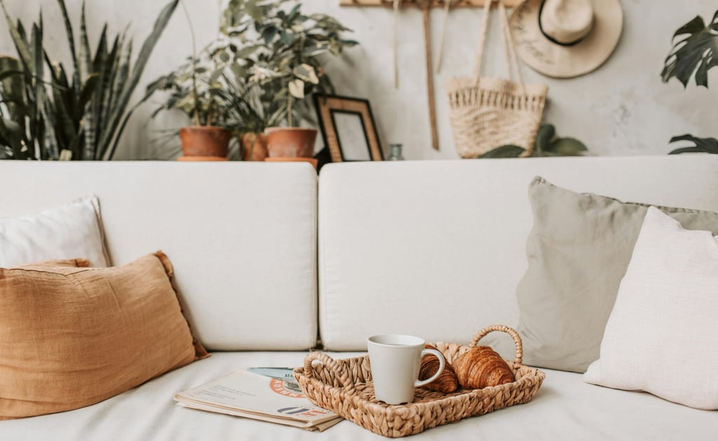
Warm tones...reds, oranges, golds, browns, and terracotta's...signal comfort and connection. They remind us of sunlight, firelight, and natural materials. Used intentionally, they can turn an ordinary room into a welcoming retreat.
Here’s how to harness the psychology of warm colors to make your home feel grounded, calm, and beautifully lived in.
1. Why Warm Colors Feel Comforting
Color affects emotion on a subconscious level. Warm hues stimulate feelings of safety, togetherness, and energy, while cooler tones create distance and quiet.
That’s why you’ll often see earthy browns and golden beige in cozy living rooms, or muted terracotta in intimate dining areas.
The trick is balance: warm tones should embrace, not overwhelm. Pair them with texture, like a woven area rug or linen curtains to, soften intensity and keep the look natural.
2. Start with a Warm Base
Every room needs an anchor. Choose one dominant warm shade as your foundation and layer from there.
Examples:
A buttery neutral wall color that flatters sunlight.
A warm oak or walnut wood tone in flooring or furniture.
A soft beige area rug that grounds the space.
From there, add medium and dark shades for depth, like rust pillows, caramel throws, or amber lighting.
3. Use Color to Guide Emotion by Room
Each space has a purpose and color can help it feel right.
Living Room
Invite relaxation with golden beige, warm gray, or terracotta. These tones make conversation areas feel connected. Try a brass or amber glass lamp to cast soft, flattering light.
Kitchen
Bring energy with muted yellows, clay, or warm white. Wood accents and woven bar stools add tactile warmth.
Bedroom
Encourage rest with warm taupe, blush, or soft cinnamon. Layer with cotton bedding and neutral drapes for a restful, nurturing atmosphere.
4. Mix Warm Colors with Natural Textures
Warm colors work best alongside organic materials. Wood, rattan, linen, and clay have undertones that harmonize beautifully. Together, they mimic the natural warmth of sunlight.
Try combining:
A terracotta vase on a wood console
A woven jute rug underfoot
A linen throw blanket over the arm of a sofa
Each piece adds another sensory layer...sight, touch, and warmth...creating a richer atmosphere.
5. Add Warmth with Lighting
No amount of color will feel cozy under harsh, cool lighting. Swap bright white bulbs for soft warm LEDs labeled around 2700K–3000K. These mimic firelight and flatter skin tones.
If possible, layer your lighting:
Table lamps for intimacy
Wall sconces for softness
Candles or diffused bulbs for nighttime calm
Lighting doesn’t just illuminate, it sets the emotional temperature of your space.
6. Anchor Warm Accents with Neutrals
If your home leans cool, gray furniture and white walls, introduce warmth through accents first.
Start small:
Add a rust-colored throw pillow to a gray sofa
Hang artwork with warm undertones
Incorporate a bamboo or wood tray on the coffee table
This keeps things balanced without a full redesign. Warm accents layered into a neutral palette are like adding sunlight to shade.
7. Don’t Forget the Seasonal Advantage
Warm tones shine in fall and winter, but they don’t need to vanish when spring arrives. Swap textures instead of colors:
Trade wool throws for light linen versions
Replace heavy rugs with flatweave cotton runners
Keep the same terracotta hues, but add greenery for freshness
Warm color palettes adapt beautifully when balanced with seasonal materials.
8. Warm Doesn’t Mean Dark
People sometimes avoid warm colors fearing their home will look smaller or heavier. But warmth doesn’t require dark tones; it’s about undertone, not depth.
Cream, honey, sand, and clay all radiate gentle warmth while keeping rooms airy. A cream rug, oak coffee table, and soft beige curtain combo feels sunlit and calm without weight.
9. Let Personality Lead
Ultimately, warm design should reflect how you live. Do you crave cozy evenings or lively gatherings? Your warmth might come from amber-toned glass, caramel textiles, or even pops of coral and blush.
There’s no wrong shade of comfort, only what feels like home to you. Choose pieces that make you exhale.
Final Thought
Color is one of the most powerful, invisible tools in design. Warm tones don’t just change the look of a space, they change the way it feels to be there.
By weaving in soft light, textured materials, and hues drawn from nature, you can create a space that feels grounded, safe, and deeply inviting.
Whether it’s a woven rug, a golden lamp, or a terracotta vase, warmth begins not with paint, but with intention.